| Contents | 1 | 2 | 3 | 4 | 5 | 6 | 7 | 8 | 9 | 10 | 11 | 12 | 13 | 14 | 15 | 16 | 17 | 18 | 19 | 20 | 21 | 22 | Previous | Next |
| 8. Exercises – Examples of Running Reports |
| Exercise 1 (Basic Reporting) | Top |
|
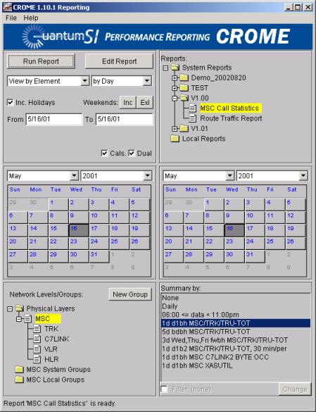
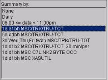
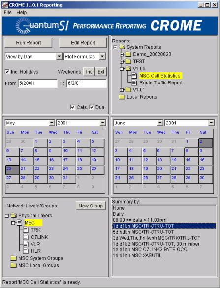
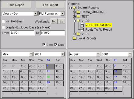
Top/Left portion of screen: Select View By Element, by Day Top/Right portion of screen: Select System Reports “MSC Call Statistics” Calendars: Select a start/stop day on the Calendars when data is available, Bottom/Left portion of screen: Select Physical Layer – MSC Bottom/Right portion of screen: Select “Summary By” 1d d1hb MSC/TRK/TRU-TOT Your Main screen should now look like this (you may have to select alternative dates in which your system as actual data.):
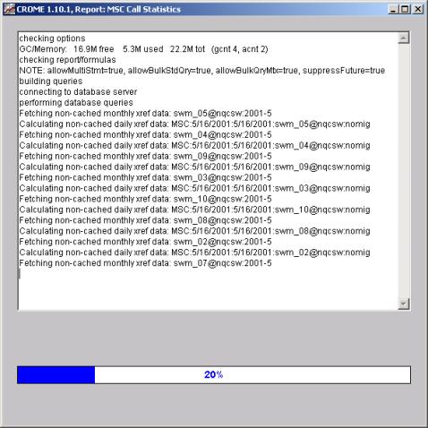
You are ready to click on “Run Report”. Clicking the “Run Report” launches a Report Item. At this point the Report Item screen will appear, showing the title of the report at the top of the window. A series of text messages will appear, giving the status of the report building process, and a blue “progress bar” at the bottom shows the percentage complete. The query itself is optimized for maximum speed by examining all database pegs from the different formulas and consolidating duplicate information.
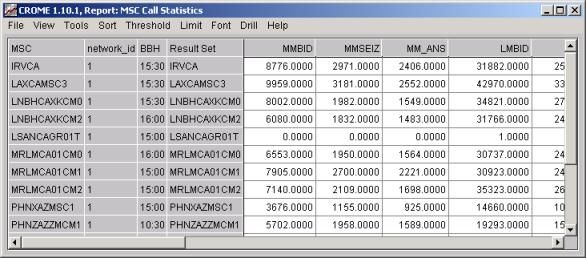
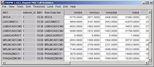
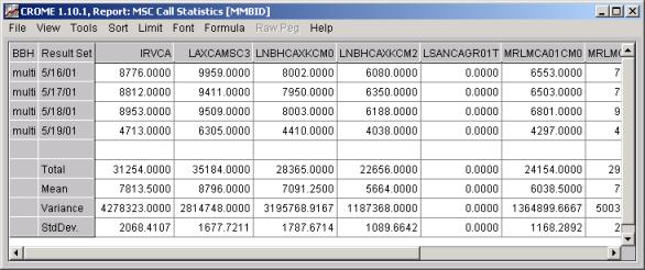
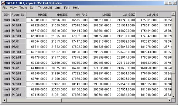
Once the Report Item has finished building, the window will automatically “switch” to either a Graph or a “Result Set” Grid (depending on you the report was defined in the Report Editor). In this example, the report was defined to first switch to the Result Set grid. The report below reflects the selections you made above: View By: Element, Summary By the bouncing busy hour defined as 1d d1hb MSC/TRK/TRU-TOT, Network Level – MSC. This output will show all the MSC results individually, for the fields in the MSC Call Statistics Report
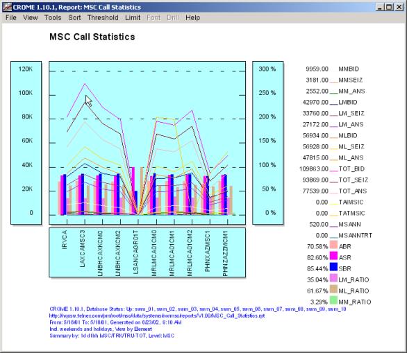
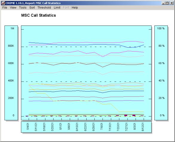
Go to the Menu Bar and select “View”, now select “Graph”. This is the same report viewed as a “Graph”
Let’s review the graph pictured above: Take your mouse and hold down the right mouse button and drag the cursor over the graph lines and watch as the legend results change – each legend shows the numerical value that is represented on the graph where the mouse is being dragged. To make the legend results stay highlighted click on the graph and drag the mouse button over the x-axis off the graph area (i.e. in the vertical direction). Also note the following: The left axis displays
the Sum and the right axis displays
a percentage. This is because, on this
particular report, some of the items plotted are “scalar” values, i.e., these
item represent counters of some sort, while other are “ratio” values, i.e.,
they represent a percentage of some sort.
In the report example, the scalar values are plotted against the left
axis, and the percentage values are plotted against the right axis. The Report Name is positioned at the top of the page. The Footer area displays a set of information, including: · The databases used · The path where the report resides · The “From” and “To” dates selected · The Date and Time the report was generated · Whether or not the report includes weekends and holidays · The physical network layer of the report (e.g., OMCR, BSC, BTS, etc.) · The name of any “Group” used to select the network elements for this report. · The “Summary by” choice made on the main screen. You never have to worry if you’ve remembered to include the “details” of the report you printed, CROME displays this for you at the bottom to provide a "traceability record". Go again to the Menu Bar and select “View - Raw Data”. This view displays all the raw data pegs used to make the formulas or fields shown above in the “Grid” and “Graph” views.
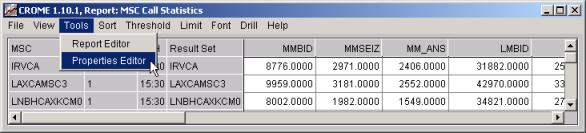
Note, CROME allows customizable cross reference (or xref) data i.e. gray columns. The menu selection "Tools / Properties Editor" allows adjustment of the displayed xref data for a specific report. This will bring up an editor that allows granular customization of xref columns.
Alternatively the menu selection "Tools / Properties Editor" allows "global", i.e. persistent, customization of the amount and verbosity of cross reference (xref) data for a specific report.
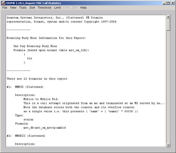
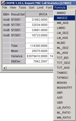
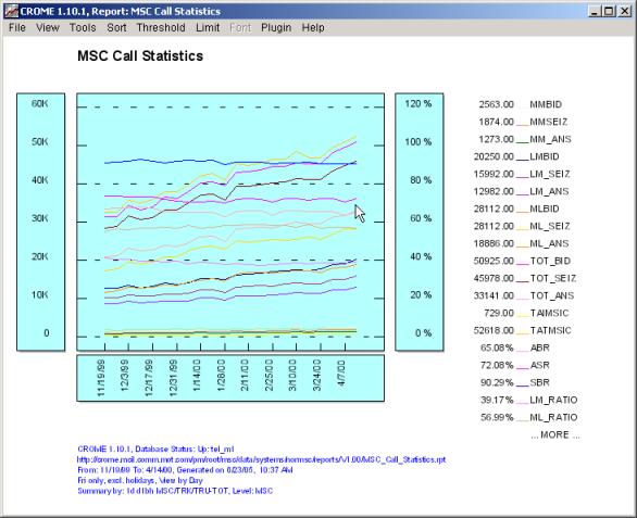
Go again to the Menu Bar and select “View – Formula” or “View – Formula (flat)”. These views describe the set of formulas used to make the fields displayed in the Graph and Result Set. The display gives you the formula name, a description (if one is available), the type (scalar or ratio), and the counters used along with the mathematical tools. If a busy hour or period was used in the creation of the "Report Item" that information is presented at the top before any formulas. You can scroll up and down to see all formulas used in this "Report Item".
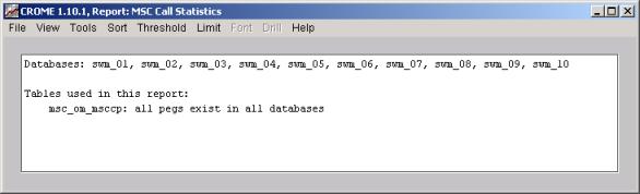
The “View – Formulas (flat)” choice is the same as the “Formulas” display, except in the case where formulas contain other formulas. CROME formulas can be defined based upon raw database pegs or on other formulas. The “Formulas” display will simply show the names of embedded formulas, whereas the “Formulas (flat)” display will expand all sub-formulas to show every equation in the report. Go again to the Menu Bar and select “View – Schema Info”. This will show any discrepancies between the data sources i.e. missing pegs or counters.
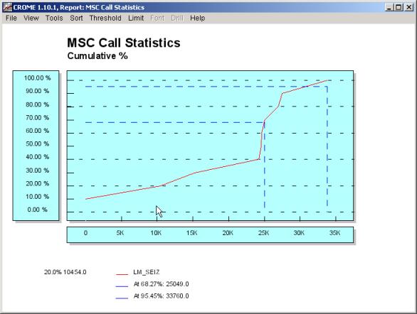
Go again to the Menu Bar and select “View – Cumulative % Graph - LM_SEIZ”. This will show a "birds eye" view of how the data for the formula LM_SEIZ is distributed.
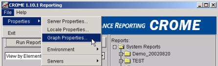
One final note, the look and feel of data in the "Report Item" can be adjusted via the "Tools - Report Editor" or the "Tools - Property Editor" drop down menus on the "Report Item" for just that "Report" item, we have previously discussed how to adjust the xref columns. You can also set the "look and feel" globally / permanently if the equivalent editors are launched from the "Main Screen" (i.e. a "Report Editor" via the "Edit Report" button or File - Properties - Graph Properties" via the drop down menu). These activities (to adjust the displayed "look and feel" of your graphs and grids) will be covered later. |
| Exercise 2 (View By Filter) | Top |
|
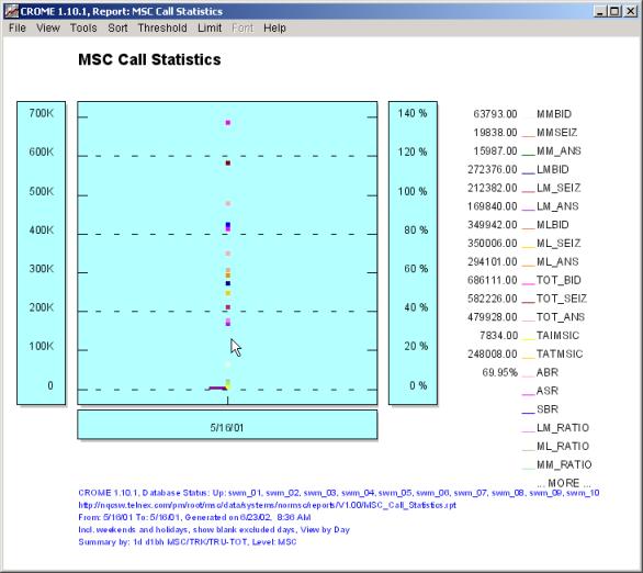
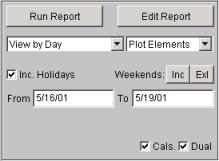
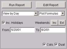
Using the same settings on the "Main Screen" as in Exercise 1, adjust the upper left "report filter" settings to “View By Day” and “Plot Formulas” (leave all the other selections the same). Run Report This time your report will roll all the MSC data together and give you the Total for all, shown below is the final Result Set.
Below is the Graph displaying the data rolled up into all the MSCs for May 16, 2001.
The above data as a graph may not be too interesting, however by changing some of the configuration settings in the main CROME screen as follows we can generate a traffic pattern across all MSCs across a given day using the same report definition:
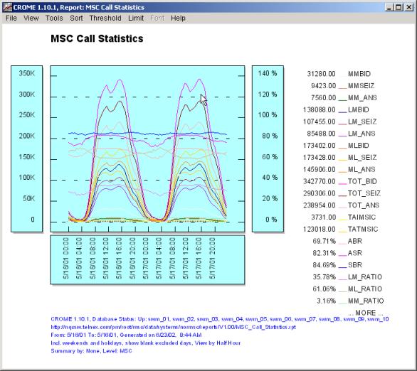
Run Report This time your report will roll all the MSC data together but break the report up into ninety (96) separate 30 minute buckets across two day mining the raw data (i.e. not taking advantage of any predefined projections for reporting speed). Use the menu and select "View/Graph" to display the multi-day traffic profile of the ten MSC systems in this query example.
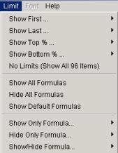
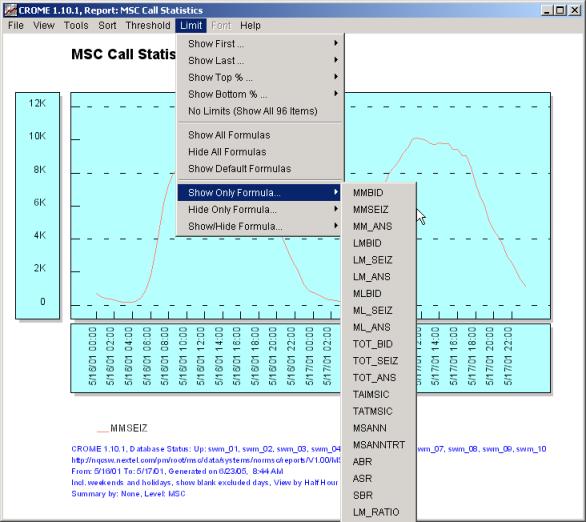
Note any formula can be enabled or disabled in the display via the “Limit” menu
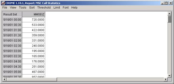
An example is shown below in which MMSEIZ has been selected, thus only that formula is displayed:
If a limit is applied to show or hide formulas it is also applied to the “Result Set” grid.
You have successfully run three “System Reports” one report in the first exercise and two variations of the same report in this (the second) exercise. In the next sections we will review how to make changes to these reports, create your own reports, create your own reporting groups, make new formulas, sort the data, and export the data to an Excel worksheet. |
| Exercise 3 (Matrix Report) | Top |
|
Using the same settings on the "Main Screen" as in Exercise 2, adjust the upper left "report filter" settings again to “View By Day” and “Plot Elements”, expand the date range to be from 5/16/01 through 5/19/01, and re-select the "1d d1bh" busy hour (leave all the other selections the same). Run Report This time your report will show the values of each MSC separately, for each day separately. The initial grid will look like this:
Unlike the previous exercise, where the “columns” represented different formulas (summed up across all the MSCs for that day), in the “Matrix” report each column is a different MSC, showing the data for one formula for that day. In a "Matrix" report the currently displayed formula is always displayed in the title bar of the report item. The above picture shows "MMBID' note the title bar:
If we switch our displayed cube slice or formula to say "LMBID" the title bar will update as follows:
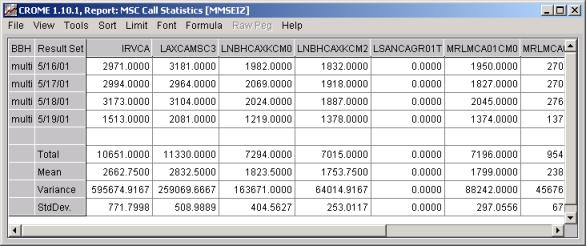
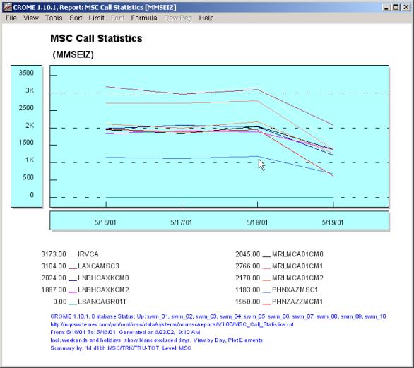
Below we once again switch (and show the Menu operation) the active formula this time "MMSEIZ":
The example above shows how to switch the grid from viewing the MMBID formula to viewing the MMSEIZ formula, resulting in:
If at this point you switch to the Graph, you will see a Graph of MMSEIZ for each MSC for each day. Once again this, take your mouse and hold down the right mouse button and drag the cursor over the graph lines (i.e. the X-axis represents days) and watch as the legend results change – each legend shows the numerical value that is represented on the graph where the mouse is being dragged. To make the legend results stay highlighted click on the graph and drag the mouse button over the x-axis off the graph area (i.e. in the vertical direction).
|
| Exercise 4 (Long Term Analysis) | Top |
|
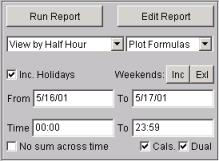
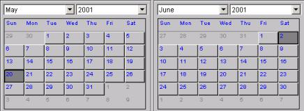
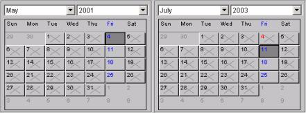
This exercise will introduce you to the flexibility of the "report filter" concept applied to one generic report. We will adjust the "report filter" to develop a long term trend line across several months. Using the same settings on the "Main Screen" as in the beginning of Exercise 2 (i.e., View by Day, Plot Formulas), adjust the selected date "report filter" settings to the range 5/20/2001 through 6/2/2001 (you may have to select alternative dates in which your system has actual data). It should be noted that your ending date is inclusive i.e., will be displayed in the report.
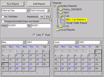
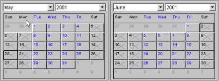
The following images of the two selection calendars shows a week long (i.e., 14 days) "report filter" date range setting that spans two months (note you can either type the dates in the above "report filter area" or select the dates in the below calendars). Your CROME main screen should now look similar to the following:
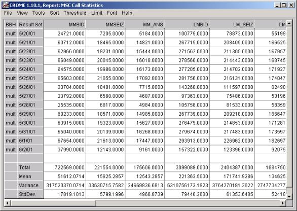
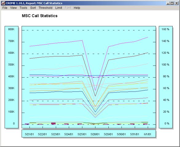
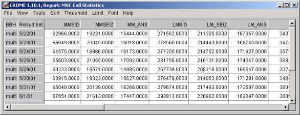
Run Report This time your report will roll all the MSCs’ data together across fourteen (14) days giving you the Total for all MSC on each day, shown below is the final Result Set (and associated graph).
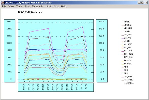
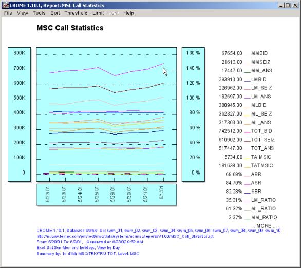
The Graph displaying the data rolled up into all the MSC’s for fourteen days starting from May 20, 2001 and ending June 2, 2001 (note in the above image we did perform a mouse over, i.e. right click held down, to show values to associated with a specific point of the X-axis You should note that the above report includes weekends, thus it lacks a bit of uniformity required for long term trending. Also note that Fridays are showing higher "peak" values. By making the following "report filter" adjustment on the "Main Screen" and re-running the report, you can effectively drop the weekends (or even the holidays) from the displays (graph, result set, and raw data set). (Note that the “Inc. Holidays” is NOT checked, and the “Exl” (or exclude) button was clicked, causing the Saturday and Sunday columns on the calendars to show Xs.
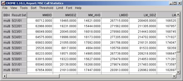
Running the report again we now see that weekends are "excluded" from the displayed data, the "Result Set" is show below:
The graph across fourteen (14) days (but showing only ten (10) days) is shown below (note that, for display purposes in the document, the header, footer, and legend information was removed via the "Tools - Properties Editor" drop down menu. This feature will be explained later.)
The CROME client can even eliminate specific days of the week (or conversely do a report on Friday's only") , for example the results for Monday 5/28/01 (see above images) look a bit low - typically this could be from a network outage or a national holiday. By clicking on the "three letter day" of the week (see below we are removing "Mon" for Monday's) that day can be excluded or included (the operation is a toggle event).
Running the report again we now see that weekends and Mondays are now "excluded" from the displayed data, the "Result Set" is show below (without the problematic Monday in the data set):
And the corresponding "Graph" view of the same data is shown below:
Remember Fridays showed higher "peak" values, thus we will make another adjustment to the "report filter" we disable non-Fridays (by clicking on the words “Mon”, “Tue”, “Wed” and “Thu” in either calendar) and further extending the range of the report from May 4, 2001 to August 10, 2001 as follows:
The new "Report Item", a Friday Only Report is as follows:
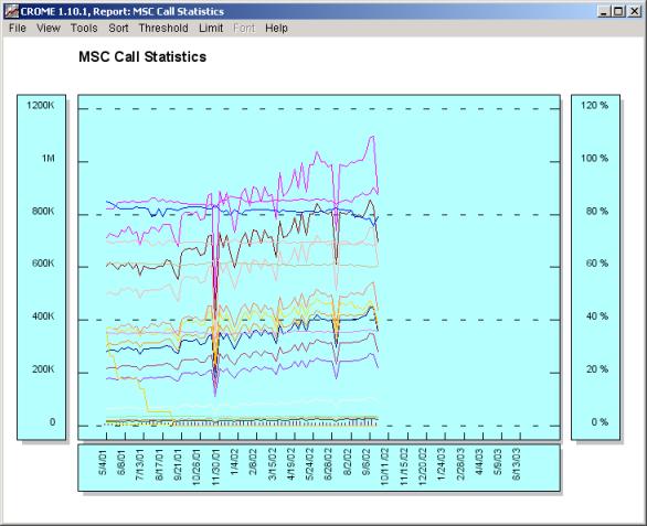
The "Friday's Only" graph across more than three months is shown below (note the options to display legends in the Graph were turned of in the below image):
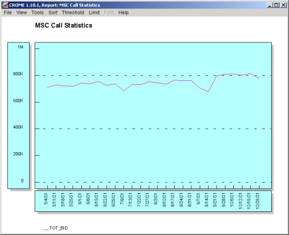
You should be able to notice a distinct slight "trend" in many of the displayed statistics. Typically for trend reporting we would want to look at just one (or a few) formulas. For example the top most formula in the above image is TOT_BID, if we run a report for just this formula (via a edit of the existing report and a quick delete of the superfluous columns. This clone/modify of an existing report is covered later) and then expand the date range to a full six months:
Once we run the report we clearly see a trend in this data set in the following image (note the options to display legends in the Graph were turned of in the below image):
It is quite easy to perform multi-year reporting in CROME by simply expanding the date ranges
Note how the July 4 2003 date (a customer defined holiday, setup in the CROME local server configuration setting) is red, this allows the user via a simple check box to include or exclude holidays and weekends from any report. The resulting report (note the sample data set ends in late 2002 (note the options to display legends in the Graph were turned of in the below image).
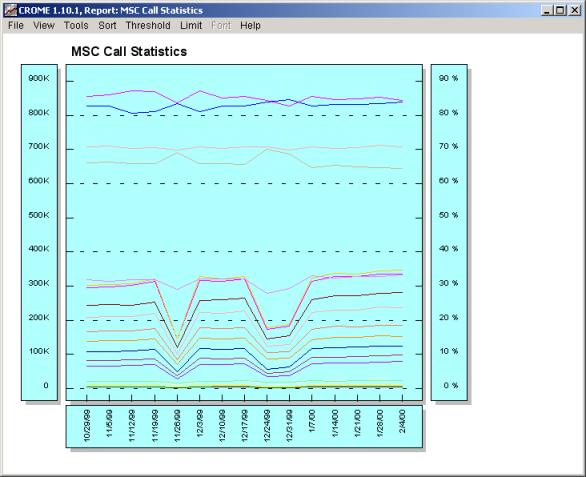
Note, the above data can be forecasted or projected into the future, refer to the section Complex reporting tasks via “PLUGINs” sub-section Forecasting via “PLUGINs”. Below we have run yet another "Friday Only" report across the new years boundary between 1999 and 2000 across a longer range on a different set of MSC switches (note the options to display legends in the Graph were turned of in the below image).
You should be able to notice a distinct "trend" once again, in many of the displayed statistics: the dips are for the Thanksgiving and Christmas holiday periods. Note that none of the administrator defined holidays (Nov. 25th 1999, Dec. 25th 1999, Jan 1, 2000, Jan 17th 2000), which can automatically be excluded, fell on a Friday. From the graph above we see that the Friday's near the Thanksgiving and Christmas holidays experienced diminished traffic. The CROME administrator could define wider holiday windows for Thanksgiving and Christmas to avoid the "dip" seen in the above graph. Next the same report run for a longer period of time on a single MSC clearly shows a trend line in the traffic experienced by a single switch across several months:
At this point you have successfully run several “System Reports” against a set of Nortel MSCs and experienced first hand on how to apply specific filtering to a report to meet your desired needs. Keep in mind that the process of reporting (or any action in the CROME client) is consistent across all system types OMCRs, OMCs, DAPs, MDGs, MSCs, and other CROME supported telecommunications infrastructure. |
| Contents | 1 | 2 | 3 | 4 | 5 | 6 | 7 | 8 | 9 | 10 | 11 | 12 | 13 | 14 | 15 | 16 | 17 | 18 | 19 | 20 | 21 | 22 | Previous | Next |
| Copyright © 1997-2005 Quantum Systems Integrators | Last modified: 30 Jun 2005 00:19 Authored by qmanual |