| Contents | 1 | 2 | 3 | 4 | 5 | 6 | 7 | 8 | 9 | 10 | 11 | 12 | 13 | 14 | 15 | 16 | 17 | 18 | 19 | 20 | 21 | 22 | Previous | Next |
| 15. Report Editor (Creating Reports) |
|
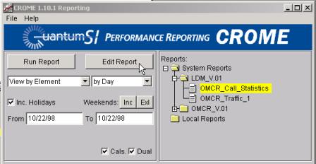
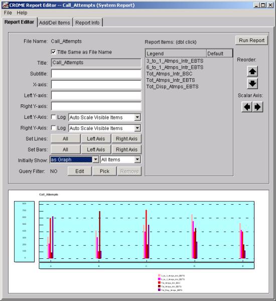
A basic feature of the CROME client is to define, create and modify generic Reports, which can be run with varying options. Details are discussed in both the preceding and following sections. End users are not allowed to modify a System Report (or a System formula), so do not worry about altering company wide defaults. For this reason Server installed "System Reports" are more traceable and more trustworthy for internal dissemination across the enterprise. To invoke an instance of report editor: 1. Go to the Main CROME Client Screen. 2. Select the System Reports Folder. 3. Select a Report from the existing list (System or Local). Note by selecting a Folder instead of an actual report item, the "Edit Report" button will change to a "New Report" button. The "Edit Report" button will bring up a copy of the selected report for editing and the "New Report" button will bring up a blank report. Single click on the Edit Report Button.
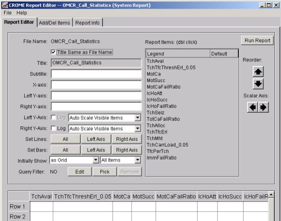
This is the “Report Editor” window, unlike the runtime "tools/report editor" menu option you can permanently add or delete “Report Items”, change from bar to line presentations, and see the results on the same screen (when you have selected that the Initial Display is to be a Graph). You can also reorder the position of the Report Items, select the Scalar Axis, and by double clicking on a “Report Item” the pop-up “Editing Data Set” window will appear as in the runtime "tools/report editor" menu.
You also have the option to default the Initial Display as either a Grid or a Graph. In the example shown above, the display is selected to display as a Grid. The Grid will only display the column headers in the Report Editor, no data will be visible. The Graph display will show either line or bars as you have selected in this Report Editor, but the values shown are for display only. Remember to order your scalar and ratios to their own axis, but if you forget the pop-up window will remind you. Pretend the Report above has more “Report Items” selected than you want on your new report (which is based on the existing report displayed in the title bar). Select the “Add/Del Items” tab to either delete existing or add new items.
|
| Add/Del Items | Top |
|
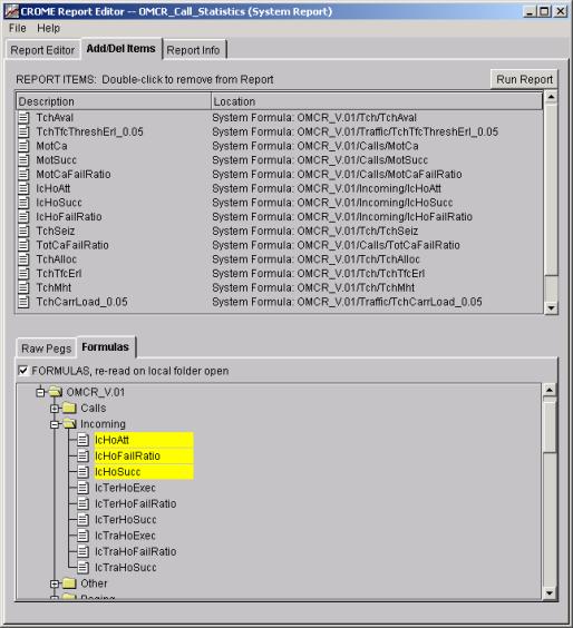
This sub-panel of the Report Editor Screen is divided into two (2) major areas, Description + Location (on top) and a nested sub-panel that can display either Raw Pegs or Formulas (on the bottom).
The Description/Location is a list of the formula and raw pegs that are currently entered in the currently displayed report. In this screen you can “Delete” any of the items showing, by double clicking with your mouse.
|
| Raw Pegs | Top |
|
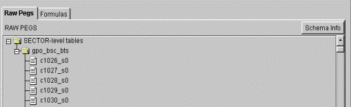
The lower nested tab panels allow reports to be constructed of either "Raw Pegs" (commonly referred to as counters) and Formulas (which consist of Raw Pegs or other nested formulas). Click on Raw Pegs (Tab) and you will see a tree starting with a folder called "omcr_db" (for Nortel/GSM systems) and under this is the folder gpo_bsc_bts (General Permanent Observations for the BSC available at the SECTOR level). These are all the counters available in the database that are configured to be seen by the CROME client. This is read dynamically each time the application is invoked, so when new pegs appear, due to schema changes, they are immediately available to the end user. Move your cursor over the counters and select/deselect (i.e. the add/delete operations) with the left mouse button.
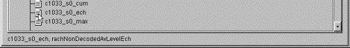
Note some systems like the Nortel/GSM have alternate naming standards that can be displayed with a right click on a Raw Peg and additional information will be displayed at the bottom of the screen.
Click on the Formula (Tab) you will see two folders, the "System Formulas" and the "Local Formulas" folder. "System Formulas" are visible to all users and installed by the CROME administrator. "Local Formulas" are created by the end user and visible to you alone. |
| Raw Pegs: which are push-down constants. | Top |
|
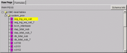
There are some special Raw Pegs that impact reporting, these items are identified via a purple color coding scheme in CROME. The report/formula developer should understand the ramifications of using these items. The first special class is a “push-down” raw peg, shown by
the icon
The color coding indicates that the Raw Peg is “special” in this case a push-down statistic or “global constant data”. If you try to run a report with just an item (or items) from only the “system_prov” table the report will be empty. This occurs as the report would reference only push down 'global constant data', since the selected physical level is below the level push down data and no other non-push down data is referenced, no elements at any sub-levels can be determined. Assume you ran a report with only “avg_lng_wa_call”, a system wide constant calculated once a day for use in iDEN reporting, at the BSC level . The report will be blank (at all levels below the OMC), further more when you a) export the data (e.g. null/empty report) you will get a message in the report as follows: NOTE:
Report has only push-down constants run at lower level. See View Formulas. or b) select “View Formulas” you will get a message like the one below: The
report has references only push down “global constant data”, since the selected
physical level is below the level push down data and no other non-push down
data is referenced, no elements at any sub-levels can be determined. You will need to add at least one peg or
formula that is not 'global constant data' to this report to get valid results.
You typically need only to add at least one peg or formula that is not “global
constant data” to your report to get valid results. Note you merely need to add any peg from any other table that is NOT color coded “purple” to get the above report to complete, this merely allows required cross referencing data for network elements (NEs) to be bound to the global constant, thus allowing the CROME report to logically present proper data. |
| Raw Pegs: which are dropped form roll-ups. | Top |
|
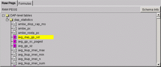
There are some special Raw Pegs that impact reporting, these items are identified via a purple color coding scheme in CROME. The report/formula developer should understand the ramifications of using these items. The second special class is a “dropped” raw peg, shown by
the icon
The color coding indicates that the Raw Peg is “special” in this case a dropped statistic typically something like a text string (which you can not roll-up mathematically) or an average which is bad math to roll-up in the DSS. If you try to run a report with such an item at a non-native level the item will be presented as NULL (and propagate through your formulas). Assume you ran a report at the the DAPC level with only “avg_dap_gp_sd”, an average that comes in at the DAP level the peg will be NULL in the report and you will get a message in the report as follows: NOTE:
Report contains 1 nulled raw-level peg.
See View Formulas. or b) select “View Formulas” you will get a message like the one below: NOTE
the following peg is used in this report but its value has been set to NULL
because this peg exists only at native level and time granularity of the
network element. It
cannot be summed across time or grouped by element and still be mathematically
correct. Table: dap_statistics To
see the value of this peg, you must (1) choose "Summary None", (2)
Choose the lowest allowable Network Level, and (3) choose either (A) "View
by Half Hour" / "Plot Elements" or (B) "View by
Element" and check "No sum across time."
|
| Schema Info – CROME handles mismatched schemas | Top |
|
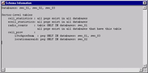
Note that when viewing Raw Pegs there is a button called “Schema Info”. This button will bring up a pop-up window showing all database tables and any mismatches between databases. This is an important and powerful feature of Crome. When attempting to make sense of statistics between a collection of subsystems, such as in any nationwide cellular network, a common problem among PM reporting is schema mismatches. Perhaps some markets are running version X of the MSC and others are running version Y, for example, and while most of the pegs from each MSC may be the same, some pegs may be missing from one MSC and appear in the other, or vise-versa. For any Crome system type (be it MSCs, OMCs, DAPs, MDGs, OMCRs, etc.), Crome determines the superset of all possible tables and all possible pegs that could exist amongst all the network elements. Then, when reporting on elements that are missing certain pegs or tables, their particular info comes in as null and is correctly merged with all of the other data. The “Schema Info” button tells you this picture, as in the following example:
In the example above, the “cell_statistics” and “ecell_statistics” tables were found to exist in each database (i.e., each market, MSO, etc.) and furthermore they were all the same version – the tables contained all the same pegs. The example also shows that a table called radio_counts only existed in one system (swo_01), and that the table cell_prov existed in all the databases but some of the pegs were different. Nevertheless, Crome can produce reports on any/all of these pegs, and the reports will generate correctly, simply “nulling” out the non-existant pegs. |
| Formulas | Top |
|
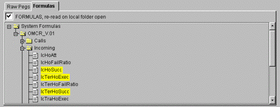
All the “Formulas” both from the system area (i.e. the Crome Web server) and your local area (i.e. those formulas you create) are listed and available to use while modifying an existing report or creating a new report. In each of the Formula folders, formulas are listed in alphabetical order. Before you start to delete or add any items scroll down and you will notice all the formulas listed above in the "Add/Del" section are highlighted in yellow in the Formula (or Raw Peg) section.
Click a few Raw Pegs and Formulas in this lower section and notice how they appear in the upper "selected" area. Now go back into the Add/Del Items (i.e. the upper area) and double click on the first “formula description”. As you are deleting the report items listed, they are no longer highlighted in the “Raw Pegs/Formula tab window. Note a right mouse click on a formula will invoke a "Formula Editor" on the selected formula, this is covered in a later section of the document. |
| Raw Pegs and Formula Legends | Top |
|
The symbols used by CROME in the report editor and formula editor are as follows:
|
| Report Info | Top |
|
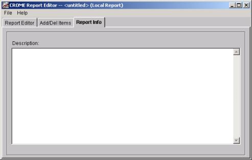
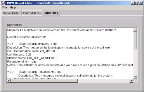
All Report Editor will present a tab for Report Info window as shown below:
Description: Is an area to make arbitrary user notes on the description of the report, or other comments for reference.
|
| Report Editor Settings and Choices | Top |
|
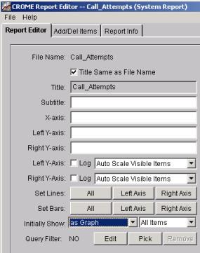
The example below shows a report with five items. We can now reorder the positions, alter the colors of each item, alter the display of each item to either a line or a bar, and rename the report. Remember when changing colors and display type (lines or bars) you must double click on the Report Item, make your selection and do a “Save/Apply", when satisfied with your adjustments do a “Save/Quit”.
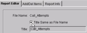
As you adjust settings on your report, a mock-up of your required changes are reflected in real-time in either the Grid or Graph display in the lower portion of the Report Editor screen. File Name: The window below illustrates change of Title Name. If the “Title Same as File Name” box is not checked the file name can be different from the title. Inexperienced users should always check the “Title Same as File Name” to force the title and file name to be the same to avoid possible confusion.
Subtitle: Add an optional “Subtitle” as reference, remembering the “Subtitle” information will show at the top of your report.
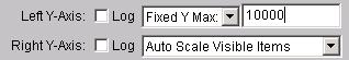
X-axis: an optional label. Left Y-Axis: an optional label. Right Y-Axis: an optional label. Left Y-axis Log: a check box to define the default axis format (Log vs. Linear) Right Y-Axis Log: a check box to define the default axis format. (Log vs. Linear) Left Y-Axis “Auto Scale” and Right Y-Axis “Auto Scale” choices:
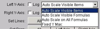
The Left and Right Y-axis scales can be configured separately. In their default mode (“Auto Scale Visible Items”) the graph auto-scales for you, so there is no need to adjust these scale choices unless you want to modify the way in which the graph is scaled. Note that each formula in the report is “associated” with an axis. If all formulas are configured for the Left Y-Axis, then adjusting the scaling for the Right Y-Axis will have no effect on the graph (and vise versa). It only has an impact if there are formulas associated with that scale. For each axis, there are four ways to configure the “scale” of the each Y-Axis. The first three choices are different ways to have CROME “auto-scale” the graph, and the last choices allows a fixed scaling: Auto Scale Visible
Items This is the default setting, and it means to allow CROME to auto-scale the Y-Axis based on the items currently shown on the graph. This means that if you use the “Limit” feature to limit to, say, the first 10 items on the graph, then the graph will auto-scale to only those 10 items. Also, if you actively hide formulas from your graph, the graph will re-scale based upon only the visible formulas. This setting will always give you the best picture for graph, because the scale closely matches the items on the graph. Auto Scale Visible
Formulas If you actively hide formulas from your graph, the graph will re-scale based upon only the visible formulas. But unlike “Auto Scale Visible Items”, the scale will not change if you “limit” to, say, the first 5 items. This has an advantage over the previous setting in that you can compare differently “limited” results against each other using the same Y-Axis scale. Auto Scale All
Formulas With this method, CROME determines the Y-Axis scale based on all values of all formulas in the report. This scale will not change, even if you “limit” the number of items or number of formulas displayed. Fixed Y Max
With this method, CROME allows you to set a specific maximum Y value for this axis. This allows you to compare any reports together using the same axis. The disadvantage is that the data returned may not match the fixed maximum, i.e., it may go up beyond your specified maximum or be too small to be seen. Set Lines Button: if you choose the All button, this will change all the items in your report to “line graphs” (items are either lines or bars). If you choose “Left Axis” or “Right Axis”, only those items assigned to the particular axis will change to lines. This same feature can also be accomplished by double-clicking on each individual item in your report and change its “graph type” from bar to line, but these buttons provide a quick shortcut. All Bars Button: just like Set Lines Button above, only it sets them all to bars. Initially Show: The first drop down allows definition of the default display mode (Graph or Grid) and second drop-down allows definition of TOP N or BOTTOM N reports (i.e., if set to “First 5 items”, then by default when the report is run, only the first 5 items will be shown). |
| Data Sets -- Formula/Legend Colors, Sort, Threshold | Top |
|
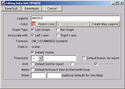
The right portion of the screen shows the formulas that are plotted on your graph. By double-clicking on one of the formulas, you bring up the “Data Set” editor, where you can change particular attributes of how that formula is represented in the graph: You can make individual changes for each field, change Axis, or select a new color, change the Bar Graph to a Line Graph, or change the Left Y-axis to the Right Y-axis, adding a threshold value, and sorting criteria.
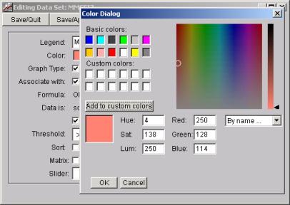
Legend: This is the name that will appear on the Graph/Grid for this Data Set (i.e., formula or raw peg). By default, it is set to the name of the formula or raw peg, but can be changed here. Color: This is the color of the bar or line on the graph for this data set. You can change it by clicking the “Select Color” button:
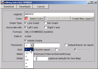
Graph Type: Choose whether or not to show this data set as a line or a bar on the graph. Associate With: Each data set is associated with either the left Y-axis or the right Y-axis on the graph. For example, if you are reporting on one item that has a range of 1 – 10, and another item that as a range of 1 – 10000, it’s best to associate each on their own axis, else the “1-10” value will be very hard to see on the graph. Also, every raw peg and formula is inherently defined as a “scalar” or a “ratio”, the latter being represented as a % value. Scalar and ratios cannot be represented on the same Y-axis, for obvious reasons, and the software will force you to separate the scalar data sets and ratio data sets on different Y-axises before you save the report. Formula or Peg: If this data set represents a formula, then this line will say “Formula” and show you the name/location of the formula. If it’s a raw peg, it will say “Peg” and show the table name and column name associated with this peg. Data is: This tells you whether or not the formula or peg is a scalar or a ratio. Ratios are treated special in CROME, in particular their results are multiplied by 100 and shown with a % sign (i.e., a ratio formula calculated as 5/10 will appear as 50% on the graph). Most database raw pegs are scalars, although occasionally there are pegs in the database that represent a percentage value. Scalars and ratios cannot be graphed on the same Y-axis (see “Associate With” above). Initially Visible. Initially Visible is, by default, checked ON. When checked, this formula will appear on the graph and grid whenever the report is run. If it is checked OFF, then by this formula will NOT appear on the graph and grid, but it (and any formula) can be interactively made visible or invisible after the report is run. This “Initially Visible” feature is useful for complex reports that may contain formulas that, while useful to display sometimes because they may form the building blocks of other formulas in the report, may not be necessary to show for the initial run of the report. Setting Thresholds and Sorts on Report Items: It is important here to note the uses of the Threshold and Sort features. The Graph interactively allows you to re-sort the data based upon any of the “data sets” (e.g., legends). In addition, CROME maintains the concept of a “default sort” for the graph. If this data set is to be the default sort (the one that appears when you bring up the graph, before you do any re-sorting), then the “Sort: Default Sort for this report” checkbox should be checked. Only one data set can be the default sort for a given report, and if you set a data set as the Default Sort then any previous Default Sort is removed. NOTE: you cannot add a default sort to a live graph (as in this example) – you can only mark a default sort when editing the report (changing default sort makes no sense to a live graph, because default sort indicates the initial sort of the graph, and if the graph is live it is already up). CROME allows you to set arbitrary thresholds on the data
and then report on only those elements which exceeded the threshold. In the screen above, note that you can set a
threshold for any data set. Once set
(and this can be set dynamically in a live graph or stored in the full Report
Editor) the choices to filter a report by its threshold values become available
on the Graph menu.
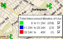
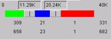
Like Default Sort, CROME also has a concept of “default threshold”, indicated by the Default Threshold checkbox. There can only be one default threshold, and it indicates to CROME which threshold to apply to the graph when it first appears. Also like default sort, it only makes sense to allow the default threshold to be set when editing a report for storage, as opposed to modifying a live graph. Note that the formulas that are a “Ratio” will have a percentage (%) symbol for the “Threshold” value. Slider (optional defaults for Geo Map): When running a report and then launching a Geo Map, the Slider Bar on the map control panel is initially set at equal increments (splitting the bar into thirds). However, you can pre-set the initial Slider Bar settings here in the Report Editor. Simply enter the desired two values in the boxes on this window. Map Legend The “Create Map Legend” and “Delete Map Legend” buttons allow you to create a specific legend to appear when showing a Geographical Map for this report. By default, if you choose to view a Map Legend on the GeoMap, the legend will default to show three lines, representing the three sections of the “triple slider” on the graph, e.g.,
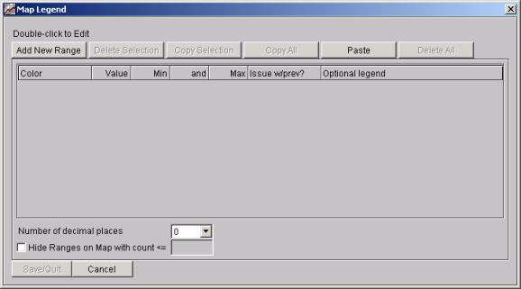
But you can also create a “Custom Legend” for each formula, with as many lines as you want, showing how many items are in each category. If you click on “Create Map Legend”, you will see the Map Legend window:
You can enter as many Map Legend lines as desired, each with their own “range” of values. Click Add New Range to create a range:
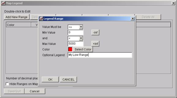
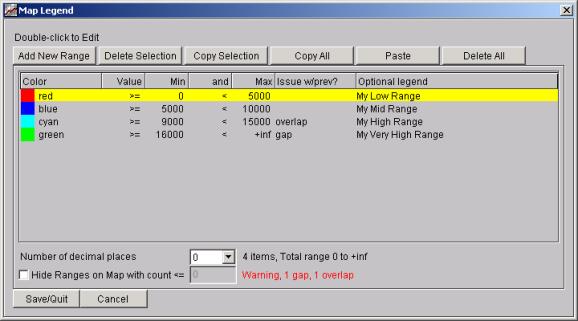
Note in the “Legend Range” popup you can enter the desired range, including use of positive infinity and negative infinity, and choose any color or legend name. For example, we’ll create four ranges in this manner, resulting in a Map Legend window that looks like:
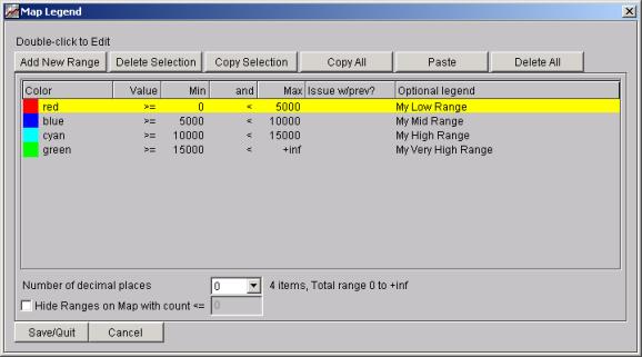
Note in the above example, our “blue” range is 5000 to 10000, but our “cyan” range is “9000 to 15000” and this causes an overlap. Hence, in the “Issue w/prev?” column it notes that the cyan line has an issue with the previous line, in this case an overlap. Also, the “green” line starts at 16000, but the cyan line ends with 15000, so this means there is a “gap” and thus some of the data would not be represented on the legend. The bottom of the screen notes, in red, the number of gaps and overlaps. So, in this example, we’ll change the cyan and green lines to remove the overlaps and gaps, resulting in:
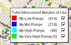
Also note the choices at the bottom of the screen: “Number of decimal places” specifies how many decimal places will be displayed on the map legend, as well as the significant number of digits in determining gaps and overlaps. The “Hide Ranges on Map with count <= “ checkbox and numeric entry allow you to ignore items on the map legend that don’t meet a prerequisite count for that group. If we Save/Quit this Map Legend, and then Save/Quit the Data Set Editor, and run this report and bring up a GeoMap, we can choose “Tools / Legend” on the Geo Map and see that the legend has now changed to no longer reflect the triple slider, but instead reflect our custom legend:
Saving/Quitting Save/Quit will save the changes and quit the editor. Save/Apply will make the changes but not quit the editor so you can view your changes before quitting the editor. Cancel: cancels your edits completely. |
| Report Editor File Menu | Top |
|
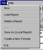
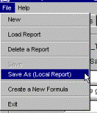
Return to the Main Screen Select: File
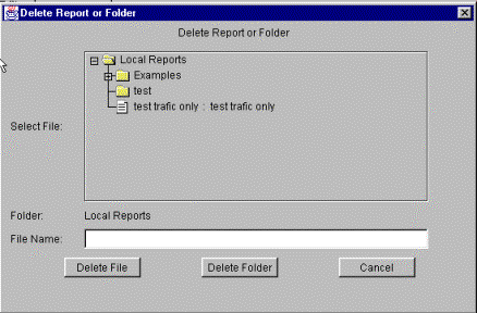
New: Brings up a Blank Report Editor. You have access to all the “Formulas” and Raw Pegs available, to create your New Report. As you select the “Formulas” and/or “Raw Pegs” in the “Add/Del Items” folder, you can switch back to the “Report Editor” and change colors and view the “values” as bar or line display if you are displaying the report as a graph. Load Report: Closes the current report you have on view, (prompting you to save the current report, if it has not been saved) before showing you the available selection of reports in both the “System” and “Local” report folders. Delete a Report: Brings up the “Local” report folder, with buttons for selecting a “Folder” or “File” click on your selection to delete.
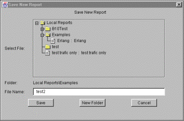
Save Report We’ve made all the changes, it’s time to save this as a new report in the local folder. This report will only be available to you on your PC or workstation, “Local” reports are local to you alone, they are not stored on the main server. Select “Save As (Local Report)”.
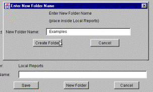
We now have the opportunity to Create a new folder for our report or save it in an existing Local folder. In the window below, I have decided to make a new folder for my report. The window reminds us that this new report will reside under Local Reports.
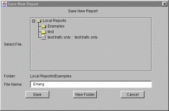
This new report will be placed in the Local folder, in my new sub folder called Examples, and my new report is called Erlang.
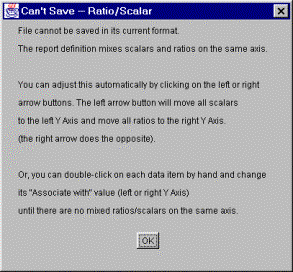
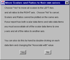
You have now successfully edited a report and created a new folder under the Local report directory. If the formulas in your report result in a mix of numbers (scalar) and percentages (ratio) and you are trying to save the report this reminder window will pop-up, asking you to move all scalars to the right axis and all ratios to the left axis.
If you see this message simply choose an axis and hit either the left or right arrows under the "Scalar Axis" label and all scalars will go to that axis and all ratios will go to the other axis.
Once you choose either the left or right arrow for the "Scalar Axis" you will be informed of what actions will be taken and asked to either accept or cancel.
Select the "Yes" button and your formulas and/or counters will be associated with the proper axis type. When you are ready to save your report. Go to File. Select Save and save the report in the Local Report folder.
You have now successfully created a new report. |
| Contents | 1 | 2 | 3 | 4 | 5 | 6 | 7 | 8 | 9 | 10 | 11 | 12 | 13 | 14 | 15 | 16 | 17 | 18 | 19 | 20 | 21 | 22 | Previous | Next |
| Copyright © 1997-2005 Quantum Systems Integrators | Last modified: 30 Jun 2005 00:19 Authored by qmanual |